
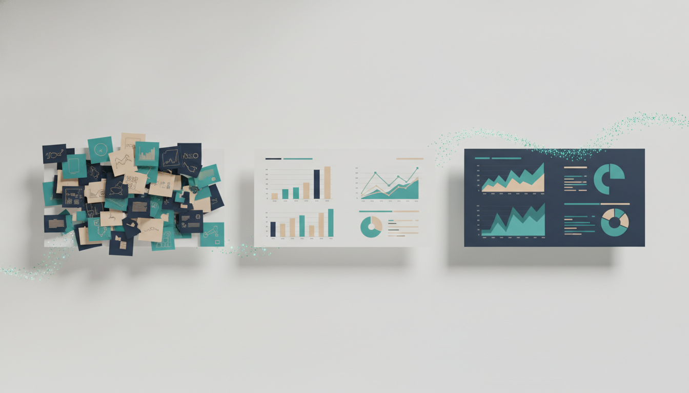
Most guides on how to make a slideshow start with software. This one starts with the argument, because that is the part that decides whether the deck works — the part no template can do for you.
If you build decks for clients, an investment committee, or a management team, "slideshow" is a slightly casual word for something that carries real weight. The deck is the record of your thinking. Someone senior will read it, form a view in the first two minutes, and hold you to whatever it says. A pretty slideshow that says nothing loses the room faster than a plain one that lands a clear point.
So before you open PowerPoint, it helps to separate the two jobs hidden inside "making a slideshow": working out what you are trying to say, and turning that into pages. Most people jump straight to the second and wonder why the result feels thin. Below is a sequence that keeps the thinking ahead of the formatting.
Step 1: Decide the one thing the deck has to prove
Every good business slideshow has a single governing message — the answer you would give if the client stopped you in the hallway and asked, "So what should we do?" Write that sentence down before anything else. "The market is consolidating and we should acquire Target X before Q4" is a message. "Market overview" is a topic, and topics do not persuade anyone.
If you cannot state the message in one sentence, you are not ready to build slides yet. You are still doing analysis, and building pages now just means rebuilding them later.
Step 2: Outline the argument, not the slides
Once you have the message, list the two to four reasons it is true. These become your sections. Under each, note the evidence — the chart, the number, the customer quote, the comparison — that makes the reason believable.
This is your storyline, and it should read as a coherent argument even in bullet form, before a single slide exists. A useful test borrowed from consulting: read only the section headers top to bottom. If they tell the story on their own, the deck has a spine. If they read like a table of contents ("Background, Analysis, Recommendations"), the argument is still buried.
Step 3: Give every slide an action title
The title bar at the top of each slide is the most valuable real estate in the deck, and most people waste it on a label. "Revenue by Region" is a label. "Revenue growth is now concentrated in two regions, which raises our concentration risk" is an action title — it states the finding, and the chart below simply proves it.
If a reader skims only the titles and still follows your logic, your slideshow is doing its job. This one habit does more for clarity than any design choice.
Step 4: Build the pages — one idea each
Now you open the software. Whatever tool you use, the discipline is the same:
- One message per slide. If a page needs two headlines, it is two slides.
- Show the evidence, not the raw data. A dumped spreadsheet is not a chart. Pull out the comparison that matters and label it directly.
- Cut ruthlessly. The appendix exists so the main body can breathe. Sensitivity tables, methodology, and backup detail live at the back, referenced when someone asks.
- Stay consistent. Same fonts, same colours, same chart style throughout. Inconsistency reads as carelessness, and careless is the last thing you want a client to feel.
Step 5: Design for the room, not the screen
A slideshow shown live in a boardroom and one emailed as a read-ahead are different objects. Presented decks can be sparser, because you fill the gaps out loud. Sent decks have to stand alone, which usually means denser slides and fuller titles. Decide which you are making before you finalise the layout, and if the deck has to do both, write it to be read — you can always talk over a self-contained slide, but you cannot rescue a cryptic one from an inbox.
Step 6: Rehearse against the hard questions
The last step in making a slideshow is not about the slideshow at all. Read it once as your most sceptical reviewer — the partner, the CFO, the committee chair who does not want to fund this. Where would they push? Every likely objection should have either an answer on a slide or a backup page you can turn to. A deck that survives your own toughest read tends to survive the meeting.
Where the tools actually help
None of the above depends on AI, and none of it can be fully automated, because the thinking is yours. What software genuinely saves is the mechanical hour — laying out pages, aligning boxes, formatting charts, and rebuilding the deck when the message shifts on Thursday night.
That is the specific gap AutoPresent is built for. You can turn a prompt or an uploaded document into a fully editable PowerPoint slideshow — feed it a diligence memo, a financial model, or a rough outline, and it drafts a structured deck you refine in PowerPoint like any other file. The output is native PowerPoint, not a locked web export, so nothing traps you when the client asks for a change in the meeting. It handles the layout so you can spend your time on the argument, which was always the part that mattered. For teams weighing whether that trade is worth it, the free tier and paid plans let you test it on a real deck before committing.
The honest limit: a tool can give you a clean, well-structured starting point in minutes. It cannot decide what your recommendation is. That judgement is the reason you were hired, and no slideshow generator changes that.
The takeaway
Making a good slideshow is mostly making a good argument and then getting out of its way. Decide the one thing you need to prove, outline the reasons, put the finding in every title, and keep each page to a single idea. Do that, and the software — whichever you choose — becomes what it should be: a way to build fast, not a substitute for having something to say.