
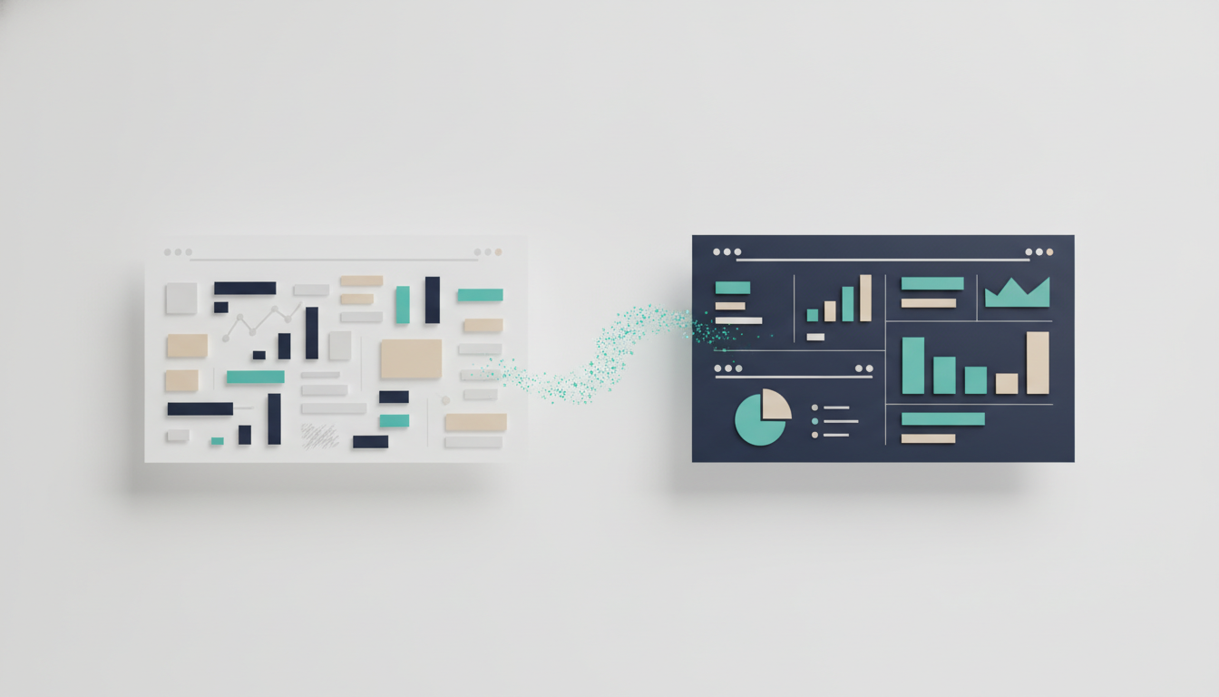
A clean, professional-looking deck is mostly a handful of decisions applied consistently. Here is how to make nice presentations with PowerPoint that look like they came from a top-tier firm — without spending your evening nudging text boxes.
Most business decks do not look bad because the person lacked taste. They look bad because forty small formatting choices were each made independently, under deadline, at 11pm. One slide has 18pt body text, the next has 14. Titles sit at slightly different heights. Three shades of blue appear that were never meant to appear together. None of it is a disaster on its own; together it reads as amateur.
"Nice" in a consulting or finance context does not mean decorative. It means the reader's eye never has to work — the structure is obvious, the numbers are legible, and nothing on the page is fighting for attention. This is a craft problem with a small number of rules, and once you apply them consistently you get a deck that looks partner-ready.
Start with a grid, not a blank slide
The single biggest driver of a professional look is alignment. Amateur decks have elements floating a few pixels off from each other; polished decks snap to an invisible grid.
In PowerPoint, turn on View → Guides and Gridlines, and set consistent margins — say a half-inch of breathing room on every edge that nothing crosses. Decide on a small number of column positions (a two- or three-column layout covers most business content) and place every element against them. When two things are meant to line up, they should line up exactly, not almost.
Alignment is invisible when it is right and glaring when it is wrong. It is also the cheapest upgrade you can make.
Fix typography before anything else
Type does more for perceived quality than any graphic. Three rules cover most of it:
- One typeface, two weights. Pick a clean sans-serif for the whole deck (the default Calibri or Aptos is fine; Arial is fine). Use bold for titles and regular for body. Resist the urge to add a second decorative font.
- A strict size hierarchy. Set a fixed size for slide titles, one for body text, one for footnotes and sources — and never deviate. A common set is roughly 24–28pt titles, 14–18pt body, 9–10pt sources. Consistency matters more than the exact numbers.
- Left-aligned, not centered. Centered body text is hard to scan. Left-align everything except the occasional cover line.
If you do nothing else, standardizing your type will make a scrappy deck look deliberate.
Use color with discipline
The fastest way to look unprofessional is too much color. The fastest way to look expensive is restraint.
Choose one primary color (often the company or client brand color), one dark neutral for text (near-black, not pure black), and one or two accents used only to draw attention — a single highlighted bar in a chart, one callout box. Everything else stays neutral gray. If your client is a bank whose brand is navy, the deck should feel navy and gray with a single accent, not a rainbow.
Set these as your theme colors under Design → Variants → Colors → Customize so every new element inherits them automatically. That one step prevents the three-shades-of-blue problem before it starts.
Make charts legible, not fancy
In finance and consulting, the chart is usually the point of the slide, and most default PowerPoint charts are cluttered. Strip them down:
- Delete gridlines, chart borders, and redundant legends where a direct label will do.
- Label the data points you are actually talking about; drop the rest.
- Use one color for context and your accent color for the number that matters — the segment growing fastest, the region you are recommending.
- Put the takeaway in the chart title as a sentence ("EMEA margin has fallen for six straight quarters"), not a label ("EMEA Margin").
A clean bar chart with one highlighted bar communicates faster than a 3-D exploded pie chart ever will.
Give every element room
Whitespace reads as confidence. Crowded slides read as anxiety. If a slide feels dense, the fix is almost never a smaller font — it is less content. Move the supporting detail to an appendix and let the main point breathe. One clear idea per slide, with space around it, looks more expensive than a slide crammed edge to edge.
Build a master, then reuse it
Once you have a title slide, a standard content layout, and a section divider that all follow the rules above, save them as Slide Master layouts (View → Slide Master). Every future slide starts from a correct template instead of a blank canvas, and the whole deck stays consistent by default. This is the difference between decorating each slide by hand and running a system.
Where the AI tools fit
If assembling all of this from scratch feels like a lot, it is — which is why a wave of tools now automate the visual layer. Gamma produces genuinely attractive web-first decks quickly, but its PowerPoint export is weak, which is a problem the moment your work has to live in a .pptx a client can edit. Beautiful.ai enforces tidy layouts through template guardrails, though those same guardrails get restrictive for dense financial content. Microsoft Copilot is convenient inside PowerPoint but its design output is still fairly generic. Each buys you speed; each has a real limit worth knowing before you rely on it.
AutoPresent sits in this space with a focus on the thing the others tend to fumble: clean, genuinely editable PowerPoint. You describe the deck — or hand it a document — and it generates a formatted, on-grid .pptx with consistent type and a coherent color system already applied, which you then adjust in PowerPoint like any normal file. The theme switcher rebrands the whole deck to a client's colors in one step, so the discipline described above is applied for you rather than enforced by hand. It is built for the consulting and finance case specifically, and there is a free tier to test it before you commit to anything. The tool handles the polish; the argument is still yours to make.
The takeaway
Nice presentations are not a matter of talent or of the flashiest template. They come from a few rules applied without exception: align to a grid, fix your type, use color sparingly, keep charts legible, and let slides breathe. Build those decisions into a master once, and every deck you make in PowerPoint afterward starts out looking like it belongs in a boardroom — because the hard part was decided before you opened the file.