
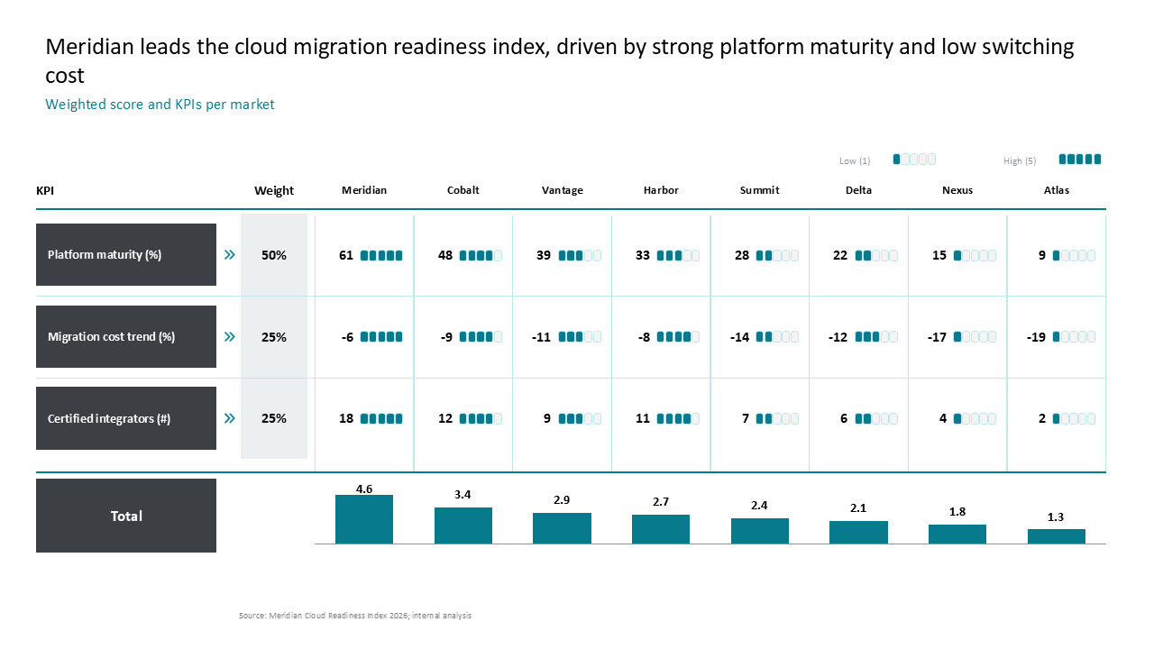
 A weighted scorecard comparing eight markets on cloud readiness metrics, featuring a consolidated bar chart and KPI grid layout
Inspiration Library folder
Dashboards & KPI Views slide templates
Browse 37 consulting-ready Dashboards & KPI Views slide templates, prompts and presentation examples from the AutoPresent Inspiration Library.
Slide inspiration
Dashboards & KPI Views slides
A weighted scorecard comparing eight markets on cloud readiness metrics, featuring a consolidated bar chart and KPI grid layout
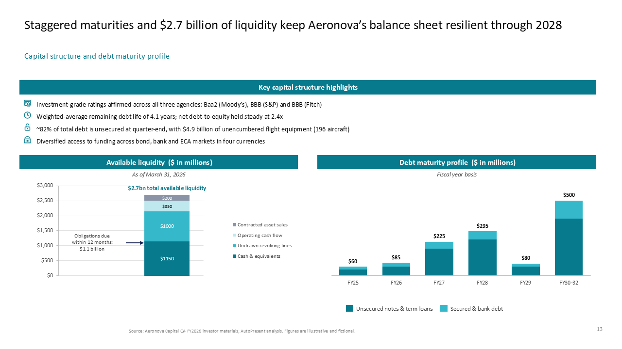 Corporate finance dashboard with liquidity metrics and debt maturity, utilizing a two-column layout with vertical stacked bar charts
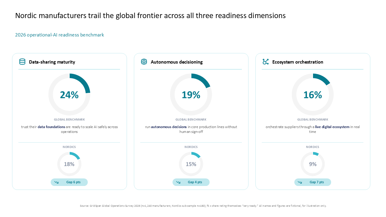 A three-column comparison slide using donut charts to benchmark Nordic AI operational readiness against global standards
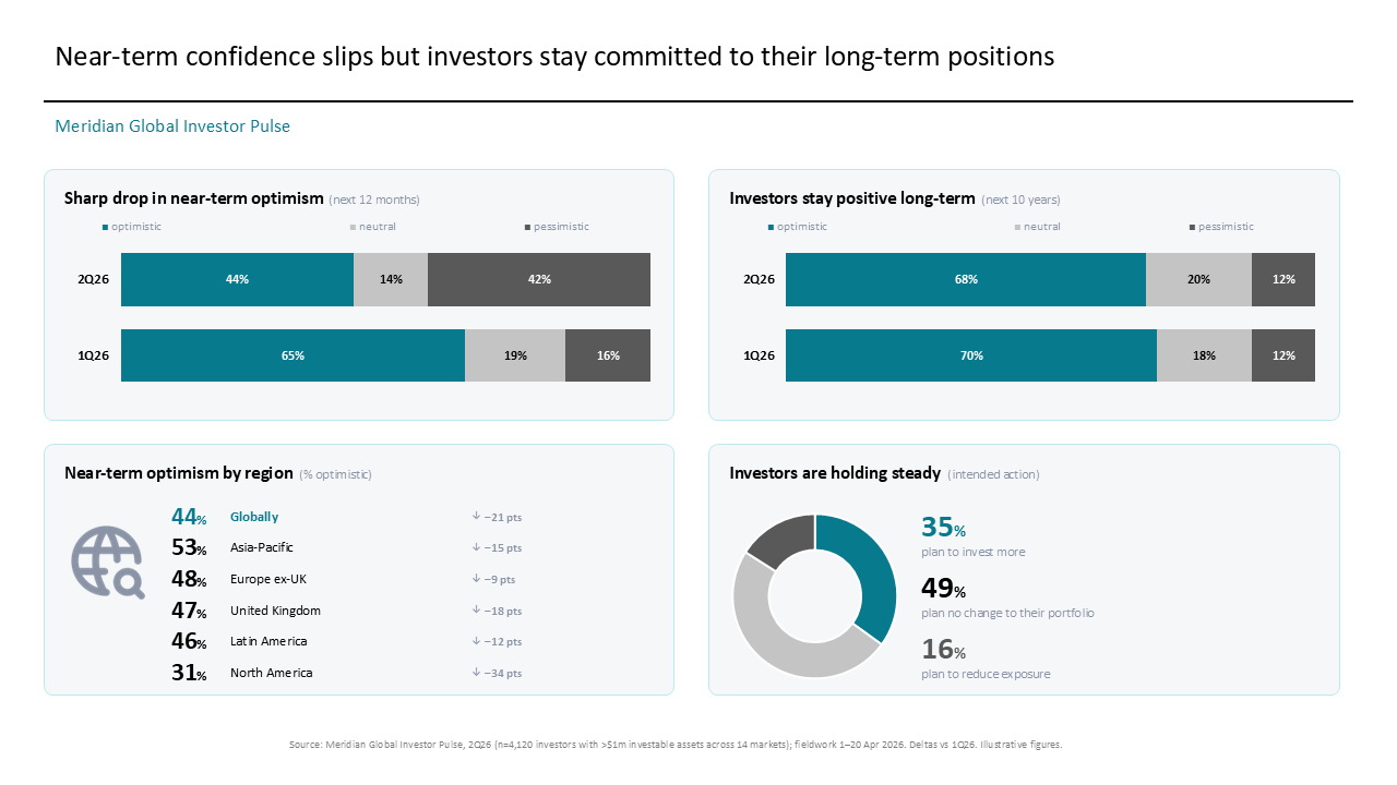 2x2 grid comparing near-term vs long-term sentiment, regional optimism shifts, and intended portfolio allocation changes
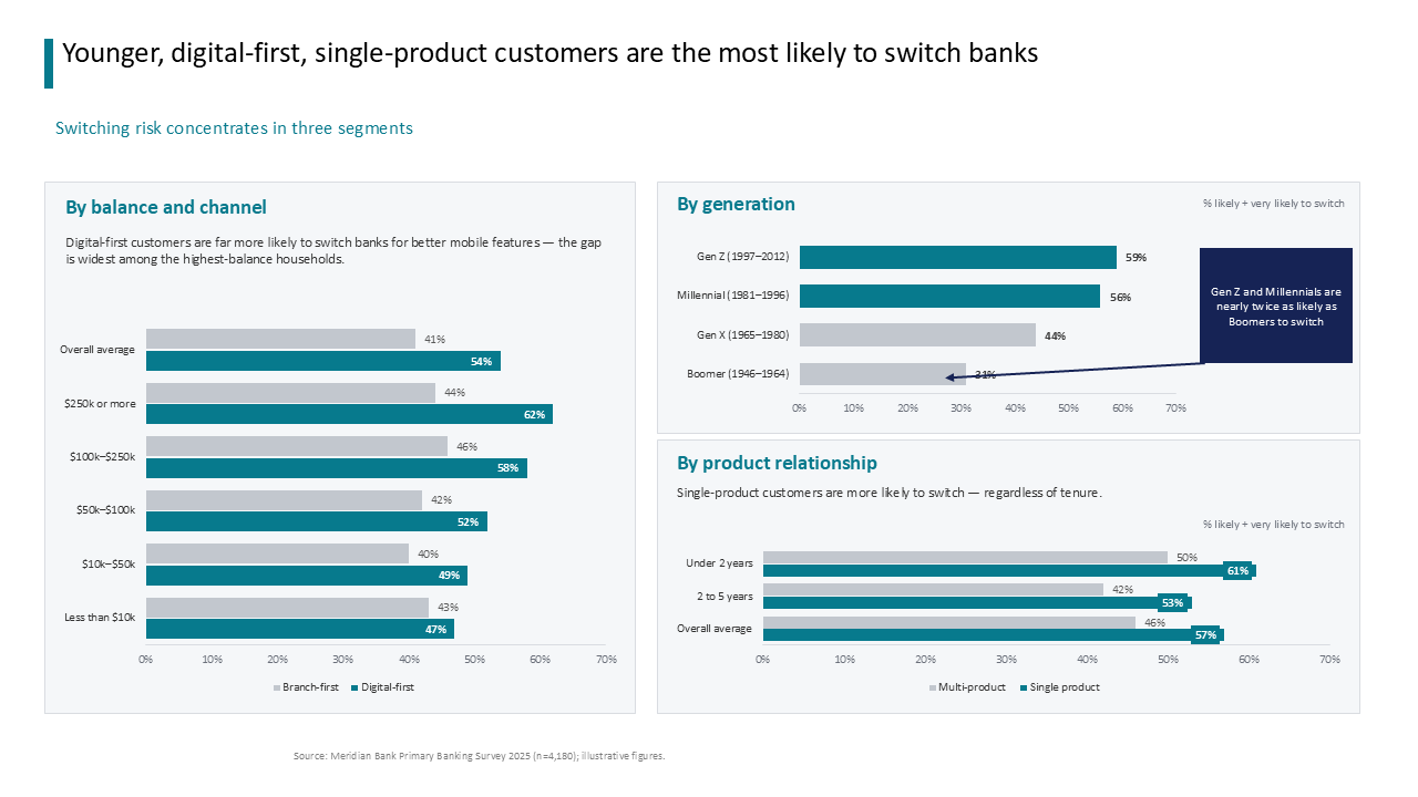 Dashboard using grouped horizontal bar charts to visualize bank switching risk across customer segments, demographics, and product tenure
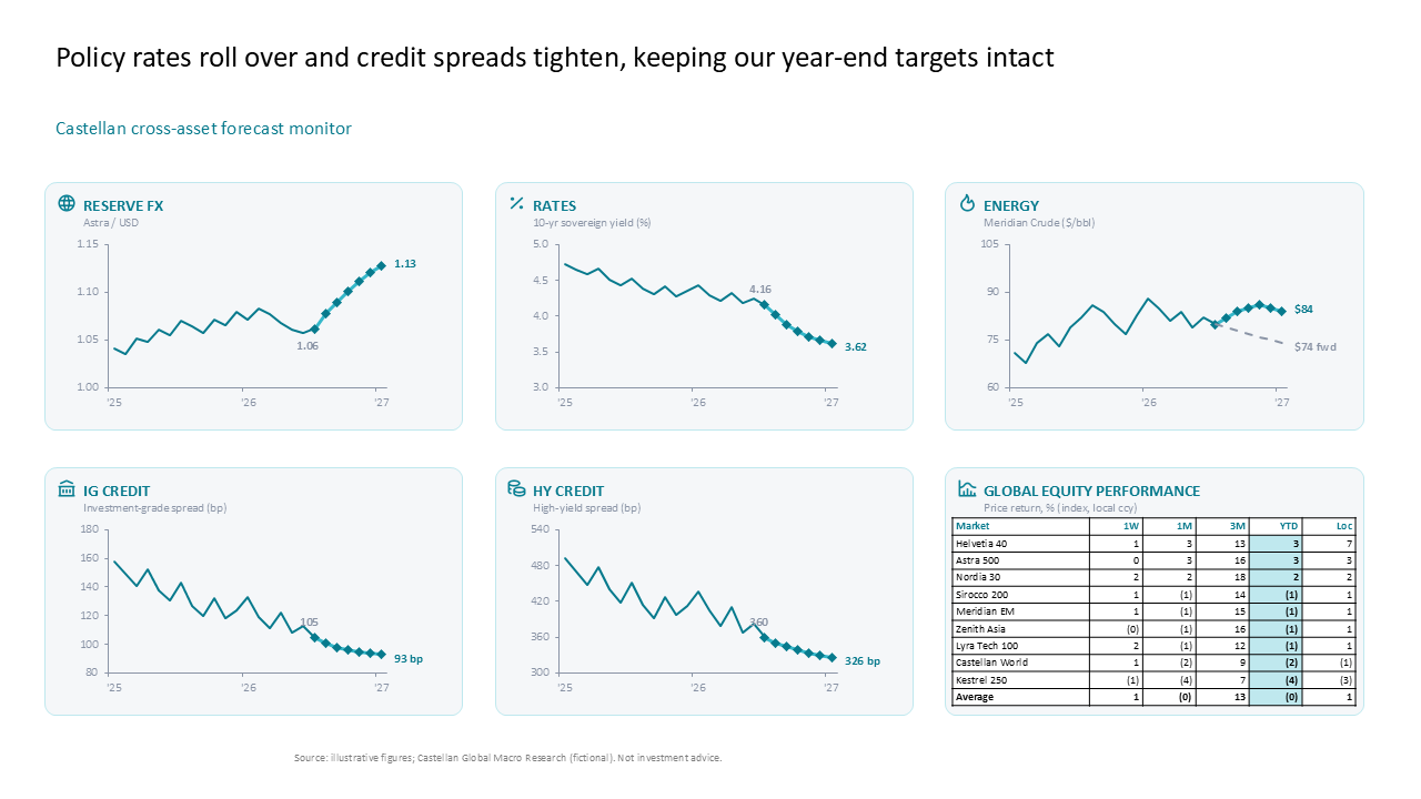 Macroeconomic dashboard with multiple line charts and a summary table for tracking cross-asset performance and forecasts
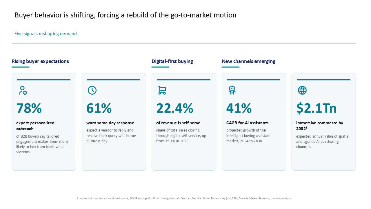 Slide highlighting go-to-market shifts using five metric-focused data cards organized by category
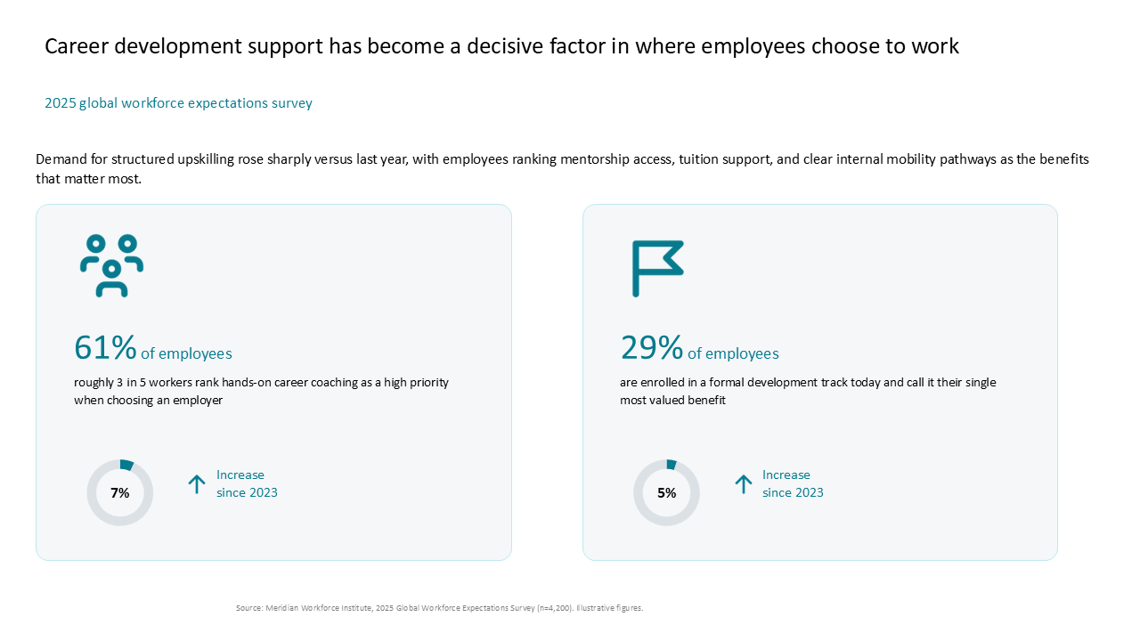 Two-card dashboard highlighting workforce survey findings on career coaching and development trends with donut charts
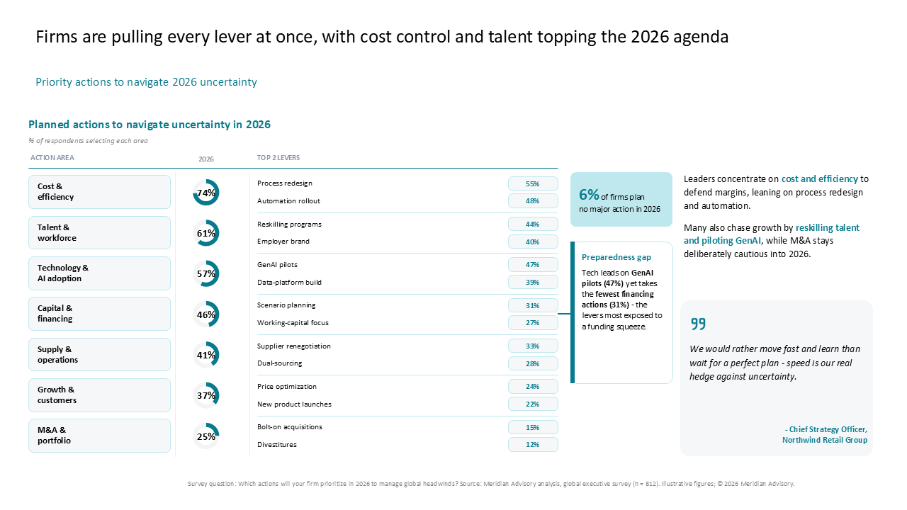 A 2026 strategic planning dashboard featuring a seven-row data table with donut charts and right-side commentary boxes for executive insi
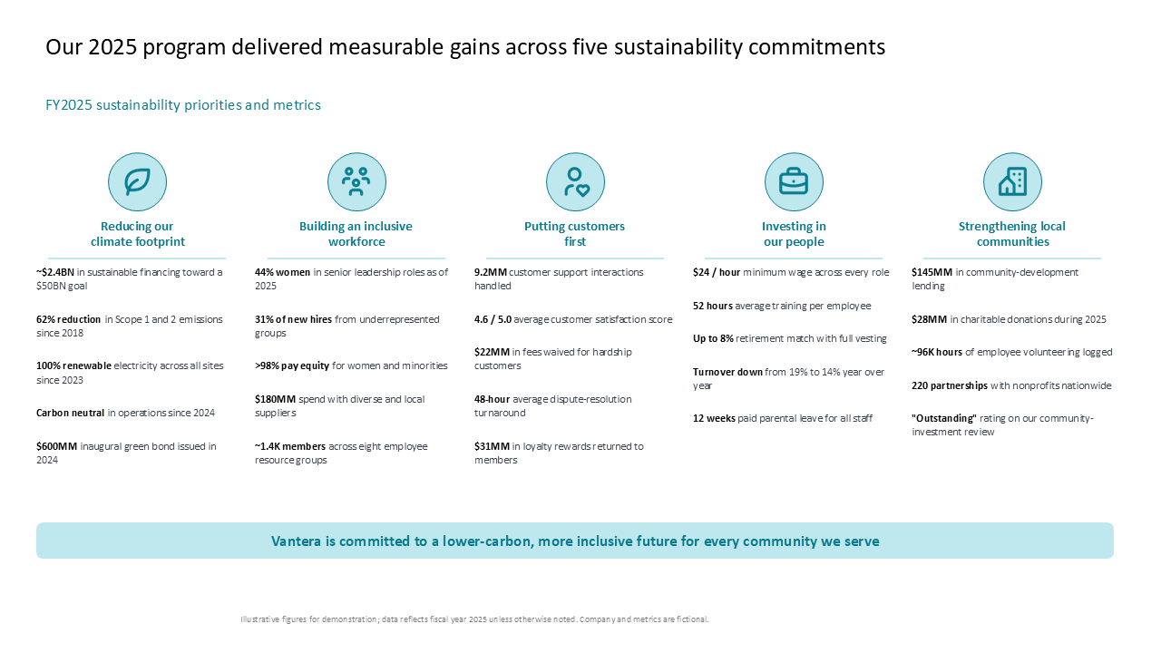 Five-column metrics grid summarizing sustainability commitments, key performance indicators, and programmatic impact across ESG pillars
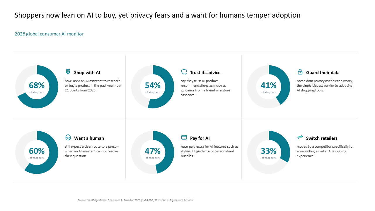 A 2x3 grid dashboard with donut charts summarizing key consumer AI metrics, including trust, privacy concerns, and adoption trends
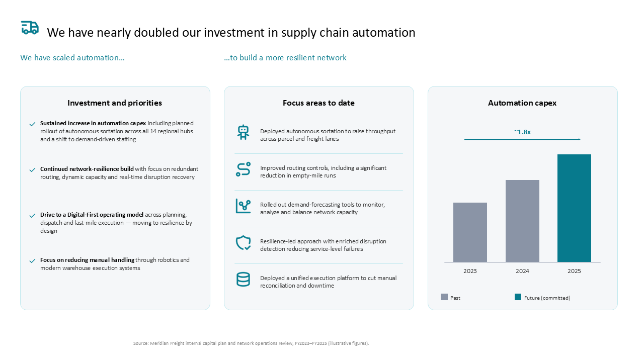 Three-column dashboard showing supply chain automation capex growth and strategic priorities like network resilience and sortation
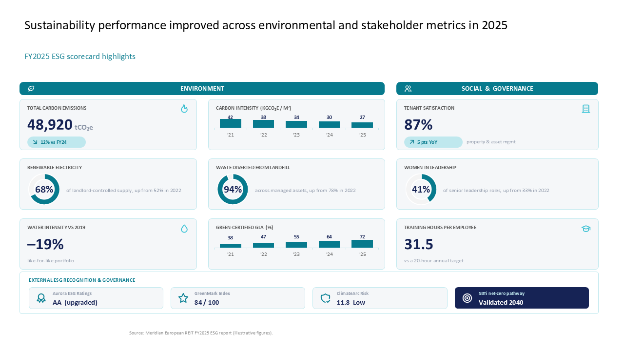 ESG scorecard dashboard displaying environmental, social, and governance KPIs with a grid-based card layout and integrated data charts
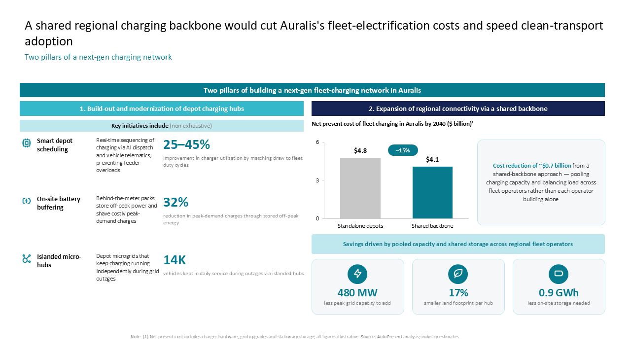 Two-column dashboard comparing fleet electrification infrastructure costs using a bar chart, icon rows, and key metric callouts
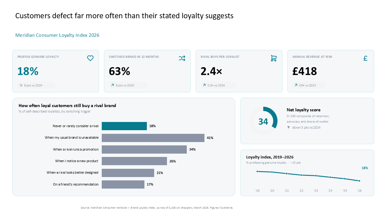 Consumer loyalty dashboard with four KPI cards, a horizontal bar chart on switching triggers, and a trend line graph
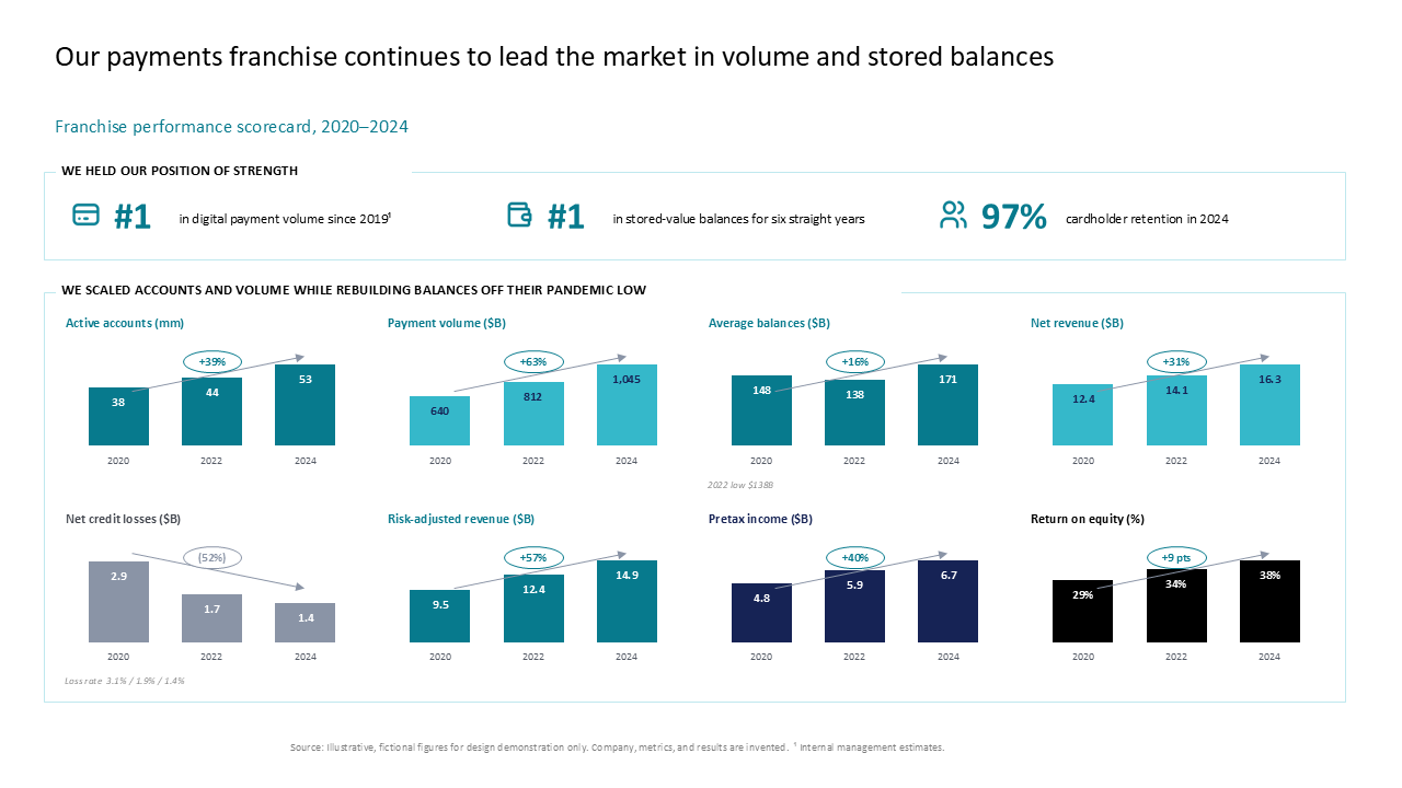 Payments performance scorecard using small-multiple bar charts in a 2x4 grid to track eight key financial metrics
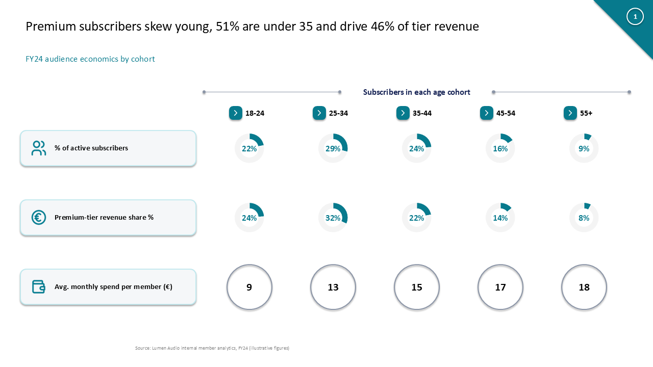 Demographic analysis showing subscriber cohorts using a 5-column metric grid with donut charts for revenue and spend breakdown
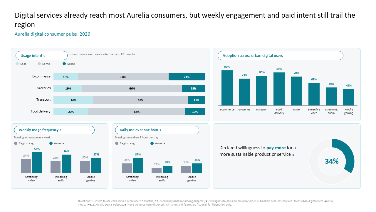 Digital service adoption dashboard featuring horizontal stacked bars, clustered bar charts, and a donut chart for sustainability trends
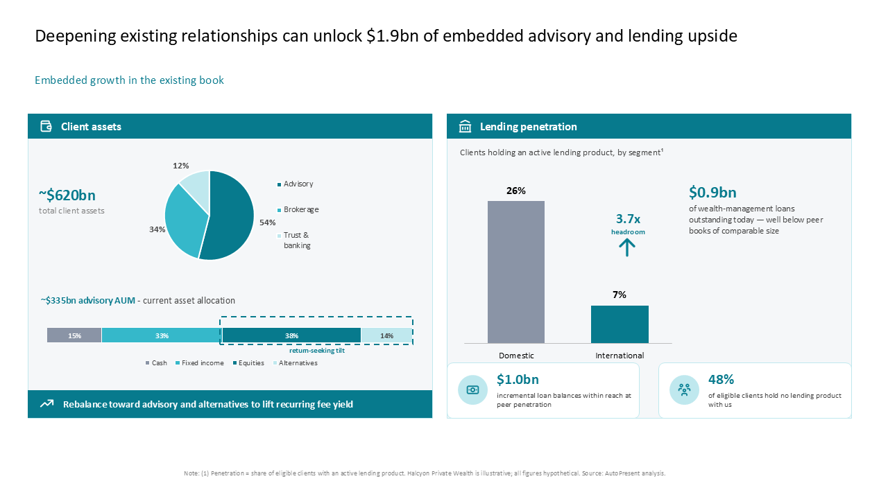 Financial services growth slide using charts and metric cards to show wealth management asset allocation and lending upside
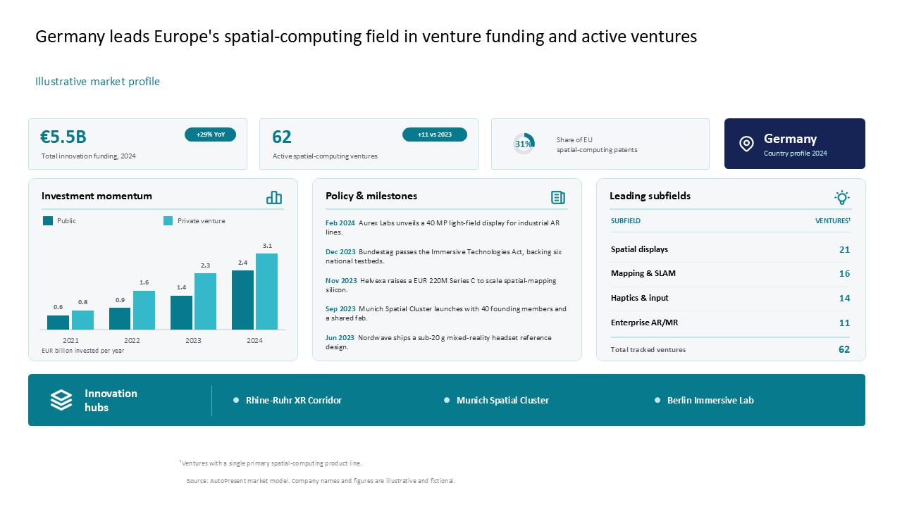 A comprehensive dashboard detailing Germany's spatial computing market with 4-column KPIs, grouped bar charts, and a sector breakdown table
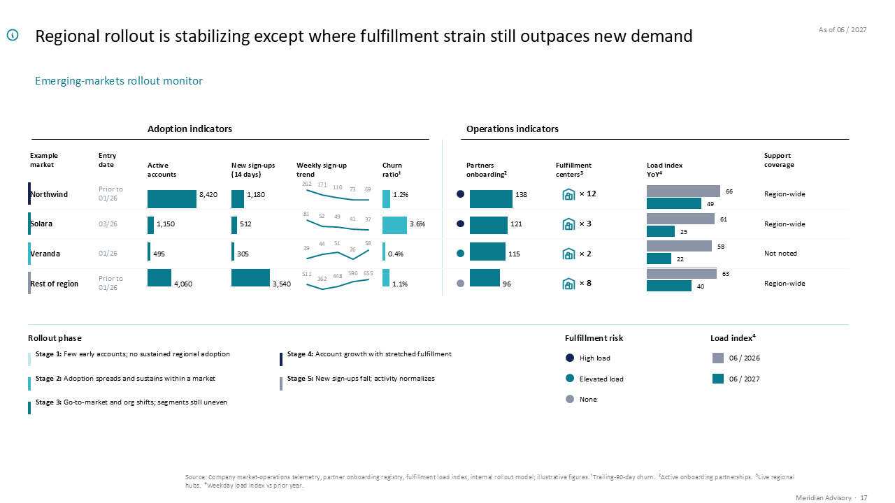 A two-panel dashboard comparing regional rollout adoption and fulfillment strain using horizontal bar charts and trend sparklines
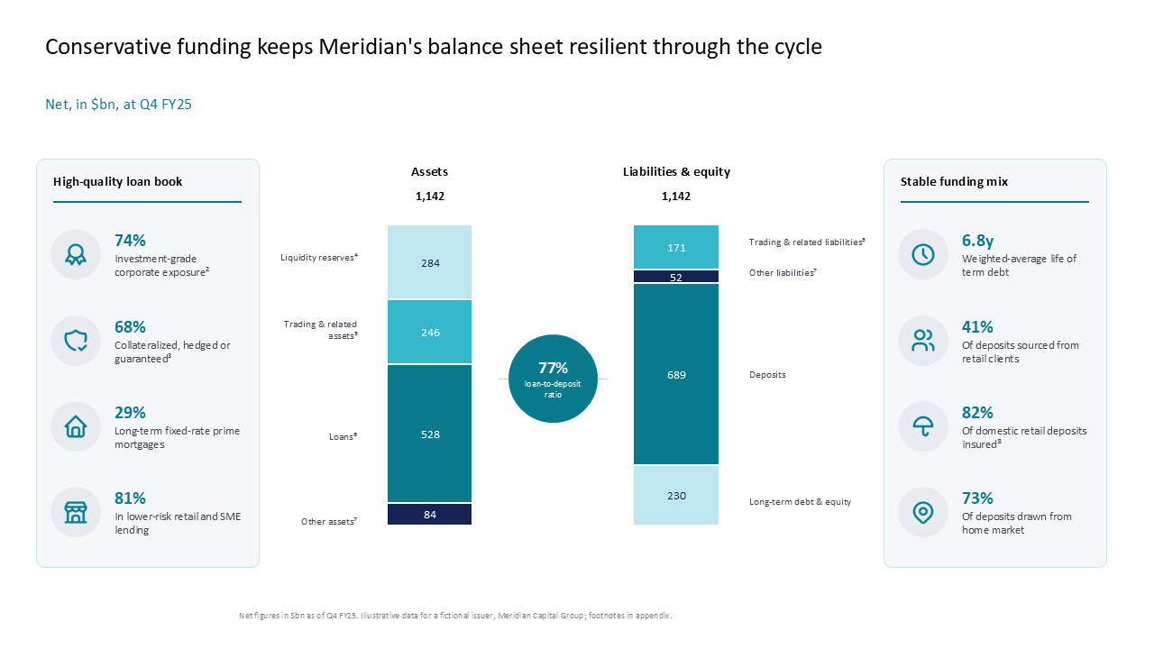 Balance sheet resilience slide with central stacked bars and side callout panels comparing assets and liabilities to show funding mix
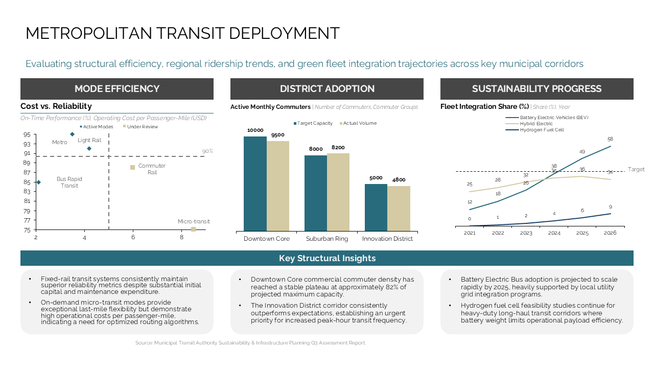 Dashboard analyzing transit efficiency, ridership, and sustainability via three-column charts and key insight boxes
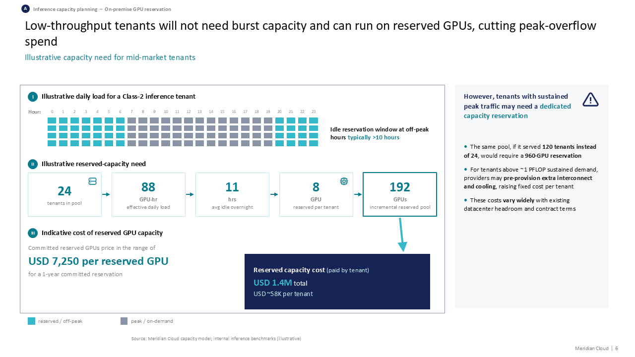 Three-part capacity model analysis showing GPU load patterns, reserved volume calculations, and cost impact with a right-side summary
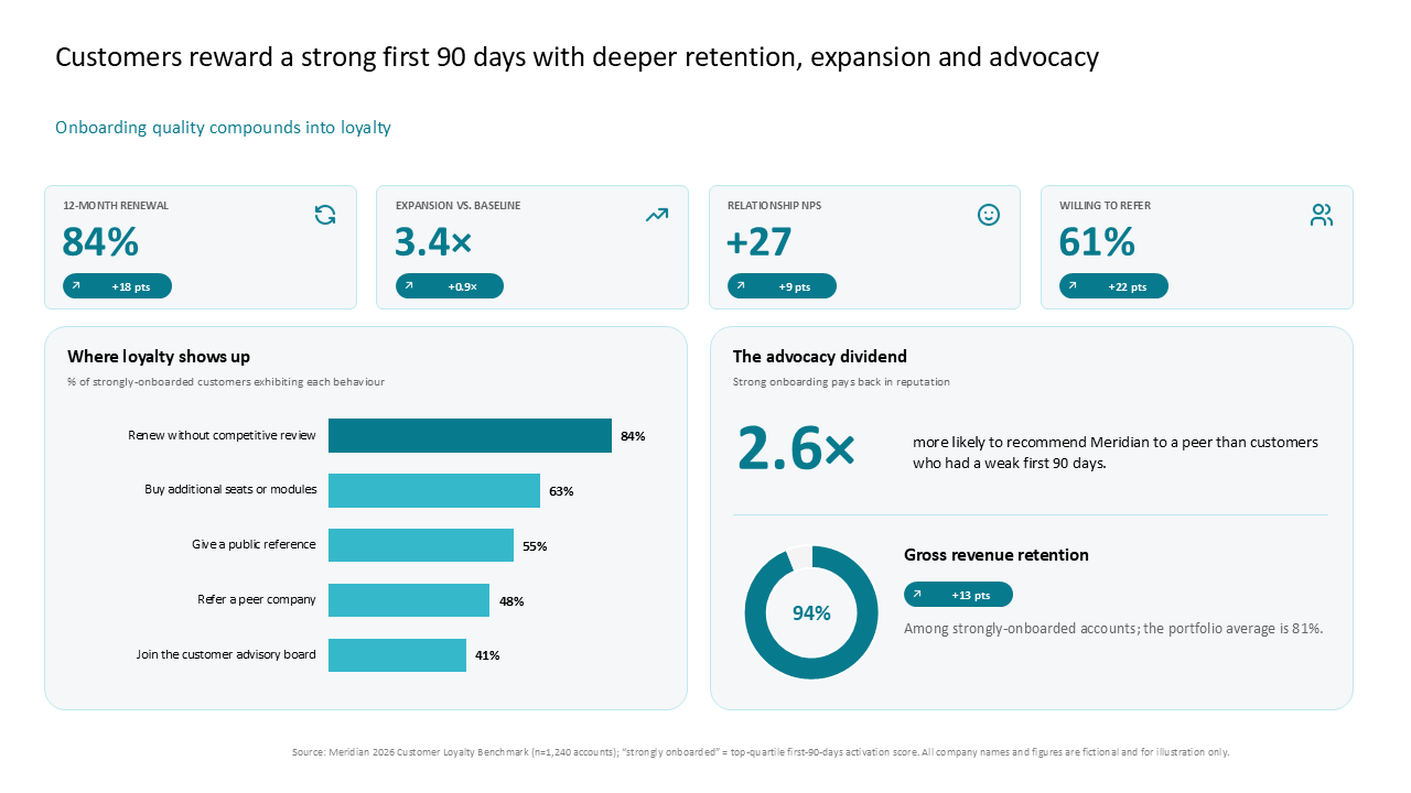 This slide tracks customer onboarding and loyalty metrics using four KPI cards, a horizontal bar chart, and a detailed advocacy panel
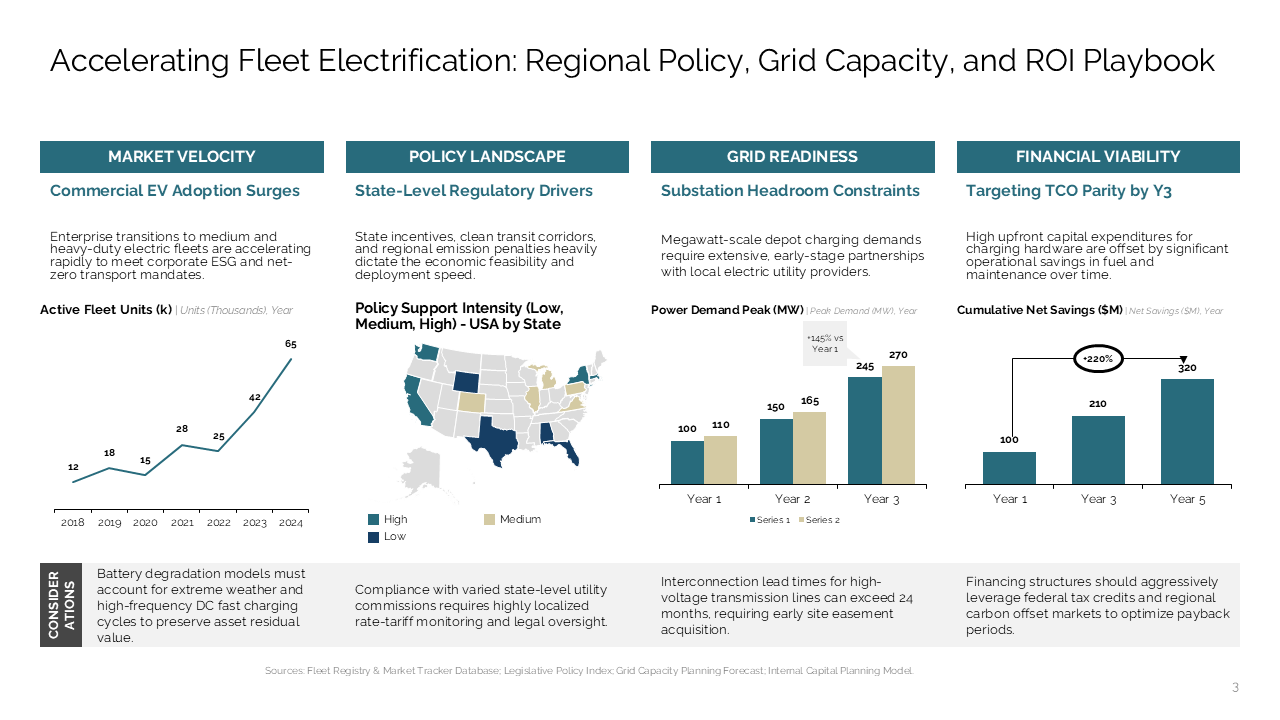 Four-column dashboard detailing fleet electrification pillars including market, policy, grid, and financial considerations
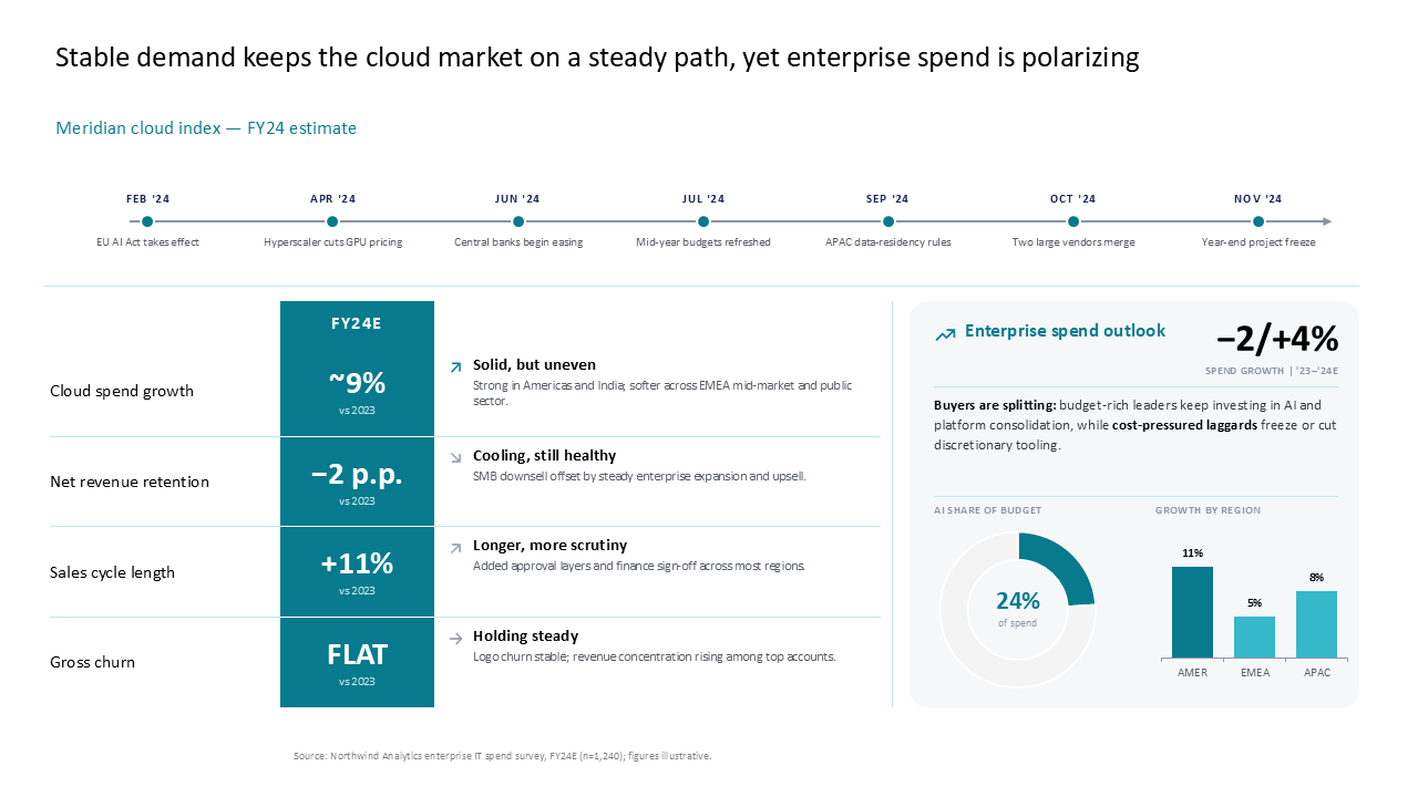 This slide analyzes the FY24 cloud market using a timeline, a metrics table, and a right-side outlook box for enterprise spending trends
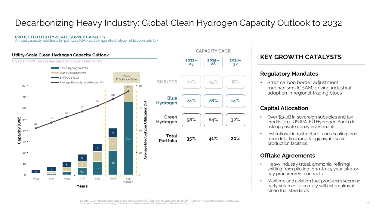 Three-column dashboard detailing hydrogen capacity projections with a dual-axis stacked bar chart, CAGR table, and key growth catalysts
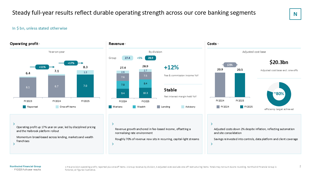 Three-column financial dashboard comparing annual operating profit, revenue segments, and cost structures using bar charts and key metrics
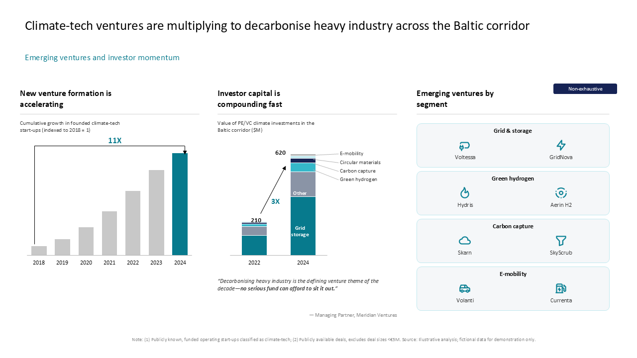 Three-column dashboard tracking Baltic climate-tech venture growth, investment trends, and segment-specific emerging players
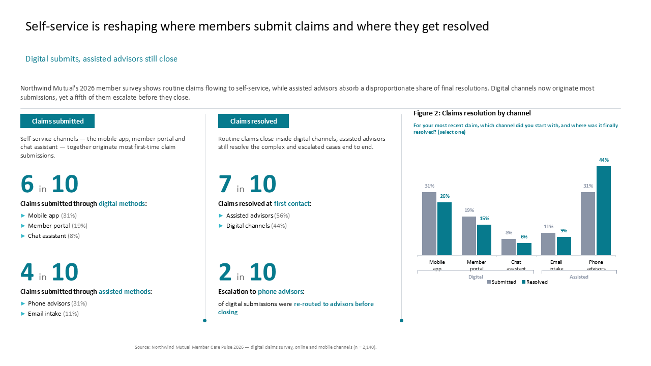 Analysis of claims channels using callout metrics and grouped bar charts comparing digital versus assisted service performance
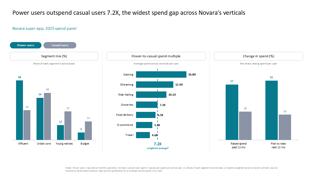 Three-column dashboard comparing power vs
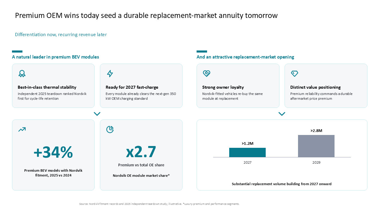 Two-column slide showing OEM BEV growth with metric callouts, icon cards, and a bar chart projecting 2029 replacement revenue volumes
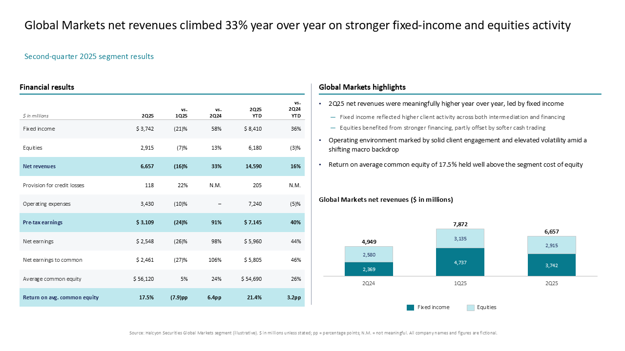 Financial results table and stacked bar chart showing Global Markets revenue performance with business highlights
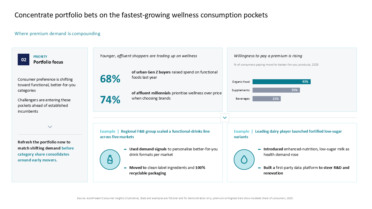 Strategic portfolio focus on wellness categories featuring key metrics, bar charts, and icon-based success stories in a three-column layout
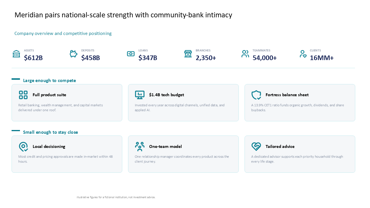 A company overview dashboard featuring a six-metric KPI row and two rows of icon cards detailing competitive value propositions
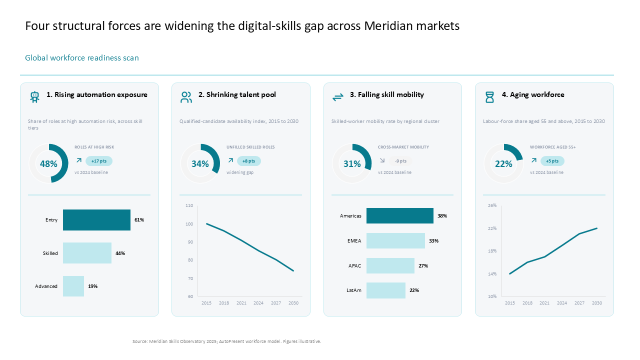 Four-column workforce readiness slide featuring donut charts and trend analysis to visualize digital-skills gap drivers
Build a board-ready slide from this inspiration.
Use AutoPresent to turn a prompt into an editable presentation.
Start creating